


Provo Craft Swarm
Hey all! Just wanted to share some information about a swarm the good people at Provo Craft are planning for early October. If you are a Cricut addict (like me!) you may want to check it out! Just click on the image to make it larger to read all the details. :)

blink?
No, you are not dreaming, hallucinating, or otherwise imagining what you are seeing. This is actually another post from me. Two days in a row. How 'bout that? ;)
Just wanted to share a layout I have up over on the Pebbles blog today. This was a fun layout to create mostly because these pics of Darian had me giggling while I worked. Will you look at my boy? He was just 1.5 years old in these photos. Such a cutie! But quite a stinker at the same time. If you read the journaling (you can click the image to make it bigger) you'll see that the "blink" was not something I happened to catch by chance with my camera. Nope - this boy gave me this face every time I tried to snap a picture of him for the longest time. Yep, he's a stinker. LOL

Pebbles has such fun embellishments and I just love these little chip shapes from the Tree House collection. I used my Cricut and the Create A Critter cartridge to cut the little branch for my birdie to rest on.

Another birdie, journaling sticker, word stickers, and a fun epoxy brad complete my layout!


I am off to catch up on laundry and pick up this mess we call a house. Football practice, apple picking, and the Jets game (woo hoo!) didn't leave much time this weekend for anything else. Thanks so much for stopping by!
Pink Paislee Blog
Hey everyone! Sorry for the lack of posts on my blog lately. I was so sure that when the boys went back to school I'd have more time, but lately it feels like there are even less hours in the day and so my poor lil' blog gets neglected. sigh.
I did want to hop on quickly and let you know that I have a layout up over on the Pink Paislee blog today. It is a "back to school" layout using the fabulous Old School collection. Here's a little peek for ya ...

If you want to see the full monty and read more about my process be sure to head on over to the Pink Paislee blog and check it out.
I am off to the Jets game today with the hubby. Let's hope they have a better showing than they did this past Monday night especially against their division rivals, the Patriots.
Pebbles Giveaway
Hey all! I'm running out the door to head to a play date with the boys shortly (they had off from school yesterday and today even though school just started Tuesday - wth? LOL) but I wanted to be sure and post about a fun giveaway over on the Pebbles blog. Be sure to stop by and enter for your chance to win some Pebbles goodies!
More Scarlet Lime Projects to Share ...
Hey everyone! I have another Scarlet Lime layout to share with you today. This one uses the Frugal Fab kit for September. It was a fun mix of products and colors and screamed "birthday layout" so that is exactly what I created with it.
These photos of Brandon make me giggle. That boy was serious about his birthday wish with his eyes scrunched up all tight and lips pursed. So stinkin' cute! I used a plain white cardstock background to really make the colors pop but splattered a few different colors of mists around to tie it all into the colors of my patterned papers.

And just a few more images of my title and some details of my layout. I wish I had more time to play with this particular kit because I really loved the colors and mix of product but I simply ran out of time.


I have one more layout to share tomorrow so be sure to check back then! :)
Scarlet Lime September Reveal
Hi everyone! Today is officially the second day of school for my boys. They had their first day yesterday and I am happy (hesitant?) to say it went off without a hitch. SUCH a big difference from last year when all 3 of us ended up in tears at one point or another. Whew!
The September Scarlet Lime gallery is up and I thought I'd share my projects over the next few days. This will actually be my last gallery as a design team member. I have LOVED designing for Scarlet Lime the past few months but I have had another opportunity present itself to me and I felt the need to readjust some of my commitments to make more time for this new endeavor. I can't share anything about this new opportunity right now but will be able to in a month or so. ;)
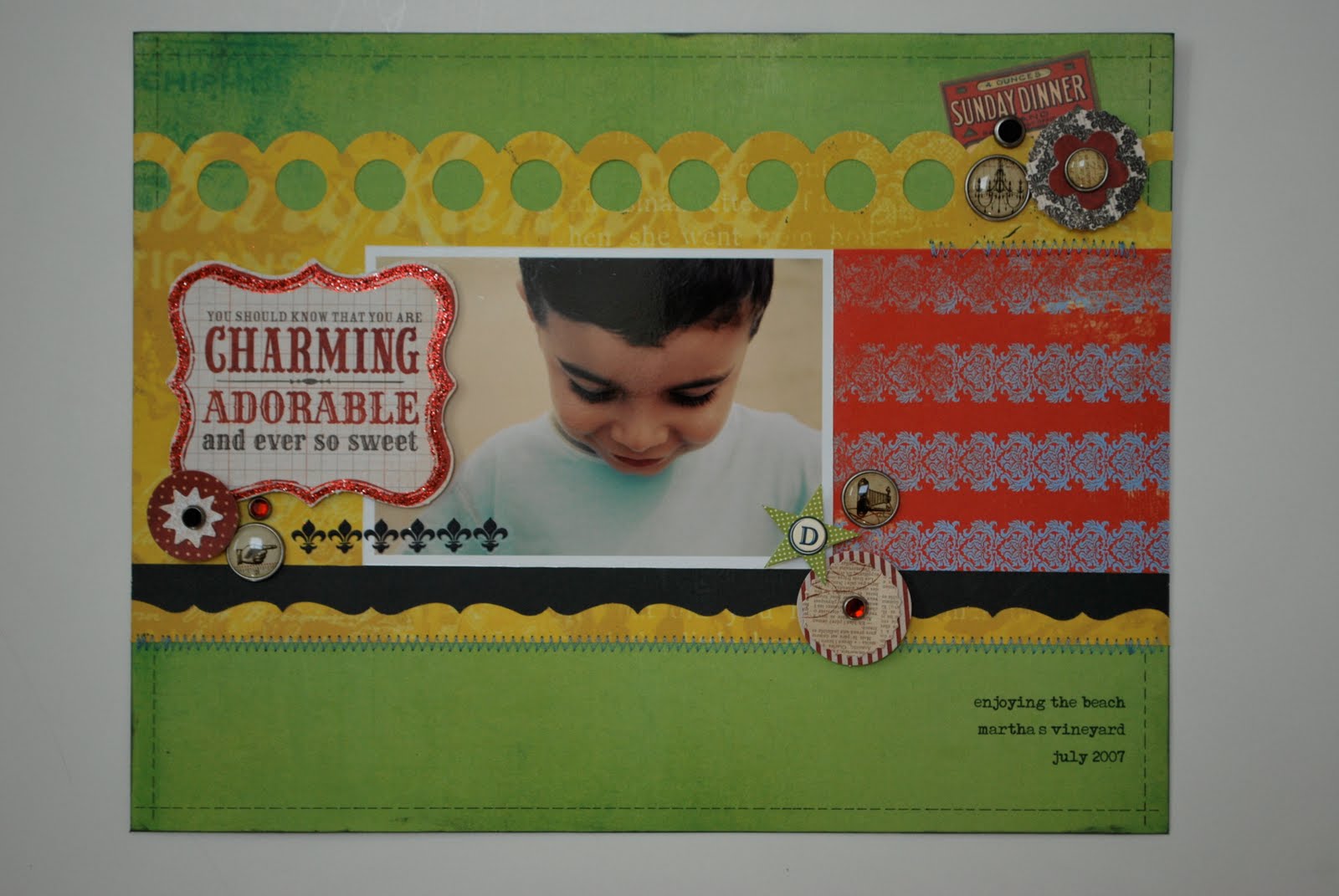
You've already had a glance at this layout from my bathroom tutorial (does that sound funny or what? lol) but I thought I'd share it again along with some of the detail images.

I love this photo of Darian. The dark fringe of his lashes is just mesmerizing (and makes this mama jealous!) and I thought they were deserving of a layout all their own. :)

There are lots of My Mind's Eye punchouts and brads included in the main kit this month and I had a lot of fun just clustering them together on my layout. I also used my brand new deep border punch from EK Success. I LOVE their punches and this one is so much fun to play with.

That's all from me today. I'll be back tomorrow with another layout to share. Thanks for stopping by!
The September Scarlet Lime gallery is up and I thought I'd share my projects over the next few days. This will actually be my last gallery as a design team member. I have LOVED designing for Scarlet Lime the past few months but I have had another opportunity present itself to me and I felt the need to readjust some of my commitments to make more time for this new endeavor. I can't share anything about this new opportunity right now but will be able to in a month or so. ;)
You've already had a glance at this layout from my bathroom tutorial (does that sound funny or what? lol) but I thought I'd share it again along with some of the detail images.

I love this photo of Darian. The dark fringe of his lashes is just mesmerizing (and makes this mama jealous!) and I thought they were deserving of a layout all their own. :)

There are lots of My Mind's Eye punchouts and brads included in the main kit this month and I had a lot of fun just clustering them together on my layout. I also used my brand new deep border punch from EK Success. I LOVE their punches and this one is so much fun to play with.

That's all from me today. I'll be back tomorrow with another layout to share. Thanks for stopping by!
School Themed Paper Piecings
Hey all! I just noticed that on the Creating Keepsakes blog today they are featuring a layout that I created for the September 2010 issue of Creating Keepsakes all about school themed accents. For my particular layout I paper pieced not only the backpack embellishment but the pencil to hold my title as well.

It's really fun to paper piece your own accents and much easier than you might expect. Be sure to stop by the Creating Keepsakes blog and check out the September issue to read all about and see lots of other fabulous back to school projects and ideas!

as seen in the September 2010 issue of Creating Keepsakes magazine.
copyright creative crafts group. posted with prior permission from the publisher.
It's really fun to paper piece your own accents and much easier than you might expect. Be sure to stop by the Creating Keepsakes blog and check out the September issue to read all about and see lots of other fabulous back to school projects and ideas!
a tutorial of sorts ...
Hey everyone! This week is just flying by and I feel like I am still just trying to play catch up, but I am moving forward and just hoping that it all gets done.
Yesterday in my blog comments I had someone ask me how I photograph my layouts. It's a question I've been asked a lot so I thought I would put together a quick tutorial of sorts. Let me start by saying this is just how I personally photograph my work. There are probably a million ways to do it that are way easier/better than mine but this is simply the way I do it and, well, it works for me. LOL Also just a little disclaimer that I use a Mac, and iPhoto as well as Photoshop are involved in part of my process. If you are a PC user you will have to kind of adapt what I'm doing to whatever photo editing software you use on your computer.
Okay first things first. You have to take your picture right? The best place to photograph your layout is in a well lit area inside your home out of direct sunlight. Sunlight is great but you don't want it glaring directly on your project otherwise that's all you'll get ... glare. So you'll need to look around and find the best place to take photos in your house and mine just happens to be ... my bathroom!

Due in large part to these two windows around my tub and one big skylight in the ceiling . . .

I take all of my photos in my bathroom with the overhead lights off. You want to avoid using artificial lights of any kind since they can add a yellowish cast to the colors in your photo and definitely DO NOT use a flash!
So next I move my bath rug out of the way and lay down just a plain piece of white foam core so I have a nice neutral background. In most cases the background doesn't show since I crop right up to the edges of my project but sometimes when I am taking detail photos of my layout you will see part of the background and the white foam core is something nice and neutral that will not interfere with the colors in my project.

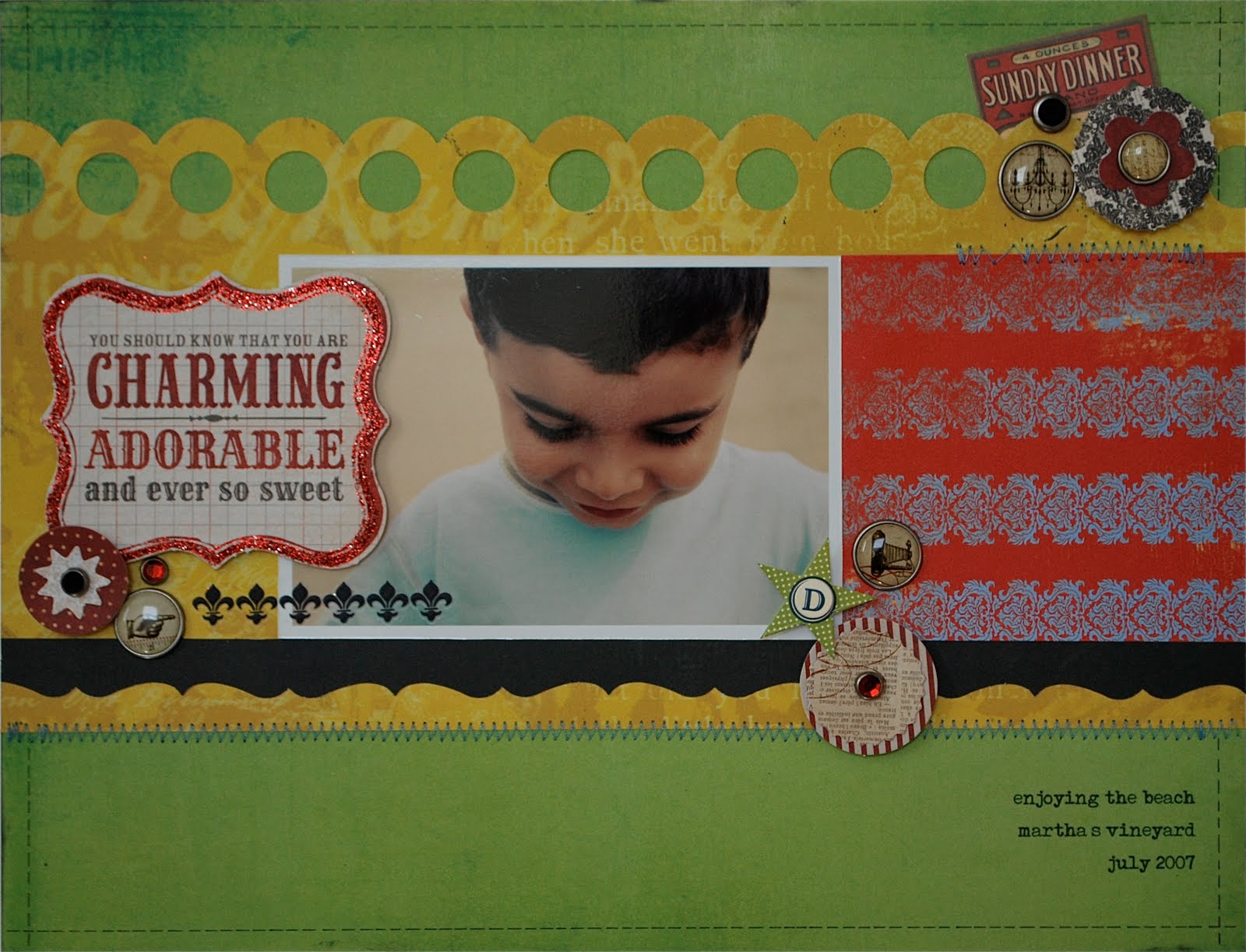
And then I simply lay my project down in the middle of the foam core, stand directly overhead, and start snapping away. By the way the project I am using as my example is actually for my September gallery for Scarlet Lime. Technically the gallery doesn't go live until tomorrow but since I needed to photograph my layout anyways I thought I would use it here. So don't tell on me that I showed it early, k?

Now I need to pause right here and define what I mean by "stand directly overhead" because this is key to getting a straight on shot of your project. I literally put my feet on either side of my project and shoot down ensuring that my camera is parallel to my project and not tilted one way or another. I will tell you that practice makes perfect. When I first started shooting my layouts this way I was constantly finding that I had tilted my camera one way or another. But now I'm pretty good at it and can get it on the first shot or two. I do always take several photos resetting my camera in between to make sure I am getting that straight on shot.
Now that my pictures are taken I head on over to my computer and upload them. Again since I used a Mac I upload all of my photos directly to iPhoto. I do a few tweaks in iPhoto before finishing the process in Photoshop so if you are a PC user you will need to adapt these next steps to whatever photo management software you use. This is what my photo looks like SOOC (straight out of camera) ...

Not bad but it definitely could use some work. It's still a little bit crooked and of course it's a little dark. So the first thing I do is straighten my photo using iPhoto. This has to be one of my favorite features of iPhoto because no matter how hard I try my pictures still end up slightly crooked. Once I've straightened my photo I then crop close to the sides. I do not leave any background showing in my images. This is my personal preference. I know some people like to see a bit of the background but for me I like to crop right up to the edge of my layout. I also use the sharpen tool in iPhoto to sharpen things up a bit. This is what my photo looks like after I'm done with iPhoto ...

I then open up my photo in Photoshop. It certainly doesn't look bad as it is now but it can definitely be brighter. So the first thing I do is go to the Layers palette and adjust the levels. For me this is the easiest way to brighten a photo and also gives me some good control since I can adjust the light, mid, and dark range tones. Once I'm satisfied I flatten my image and then go to the File tab and select "save for web and devices." This is what I use to resize my photos for the web. I've been asked what size I use and I always resize to 550 pixels on the longest side at 100 quality. This usually comes out to right under 300KB which is what most publications state is their size limit for sending attachments (saves me from having to resize any image I want to send in for a call).

And that's about it. I now have an image that is ready for the web and looks a little something like this ...

I hope this has helped some of you and of course if you have any specific questions regarding my process (or anything else you'd like to know) please feel free to ask. :)
Yesterday in my blog comments I had someone ask me how I photograph my layouts. It's a question I've been asked a lot so I thought I would put together a quick tutorial of sorts. Let me start by saying this is just how I personally photograph my work. There are probably a million ways to do it that are way easier/better than mine but this is simply the way I do it and, well, it works for me. LOL Also just a little disclaimer that I use a Mac, and iPhoto as well as Photoshop are involved in part of my process. If you are a PC user you will have to kind of adapt what I'm doing to whatever photo editing software you use on your computer.
Okay first things first. You have to take your picture right? The best place to photograph your layout is in a well lit area inside your home out of direct sunlight. Sunlight is great but you don't want it glaring directly on your project otherwise that's all you'll get ... glare. So you'll need to look around and find the best place to take photos in your house and mine just happens to be ... my bathroom!

Due in large part to these two windows around my tub and one big skylight in the ceiling . . .

I take all of my photos in my bathroom with the overhead lights off. You want to avoid using artificial lights of any kind since they can add a yellowish cast to the colors in your photo and definitely DO NOT use a flash!
So next I move my bath rug out of the way and lay down just a plain piece of white foam core so I have a nice neutral background. In most cases the background doesn't show since I crop right up to the edges of my project but sometimes when I am taking detail photos of my layout you will see part of the background and the white foam core is something nice and neutral that will not interfere with the colors in my project.

And then I simply lay my project down in the middle of the foam core, stand directly overhead, and start snapping away. By the way the project I am using as my example is actually for my September gallery for Scarlet Lime. Technically the gallery doesn't go live until tomorrow but since I needed to photograph my layout anyways I thought I would use it here. So don't tell on me that I showed it early, k?

Now I need to pause right here and define what I mean by "stand directly overhead" because this is key to getting a straight on shot of your project. I literally put my feet on either side of my project and shoot down ensuring that my camera is parallel to my project and not tilted one way or another. I will tell you that practice makes perfect. When I first started shooting my layouts this way I was constantly finding that I had tilted my camera one way or another. But now I'm pretty good at it and can get it on the first shot or two. I do always take several photos resetting my camera in between to make sure I am getting that straight on shot.
Now that my pictures are taken I head on over to my computer and upload them. Again since I used a Mac I upload all of my photos directly to iPhoto. I do a few tweaks in iPhoto before finishing the process in Photoshop so if you are a PC user you will need to adapt these next steps to whatever photo management software you use. This is what my photo looks like SOOC (straight out of camera) ...
Not bad but it definitely could use some work. It's still a little bit crooked and of course it's a little dark. So the first thing I do is straighten my photo using iPhoto. This has to be one of my favorite features of iPhoto because no matter how hard I try my pictures still end up slightly crooked. Once I've straightened my photo I then crop close to the sides. I do not leave any background showing in my images. This is my personal preference. I know some people like to see a bit of the background but for me I like to crop right up to the edge of my layout. I also use the sharpen tool in iPhoto to sharpen things up a bit. This is what my photo looks like after I'm done with iPhoto ...
I then open up my photo in Photoshop. It certainly doesn't look bad as it is now but it can definitely be brighter. So the first thing I do is go to the Layers palette and adjust the levels. For me this is the easiest way to brighten a photo and also gives me some good control since I can adjust the light, mid, and dark range tones. Once I'm satisfied I flatten my image and then go to the File tab and select "save for web and devices." This is what I use to resize my photos for the web. I've been asked what size I use and I always resize to 550 pixels on the longest side at 100 quality. This usually comes out to right under 300KB which is what most publications state is their size limit for sending attachments (saves me from having to resize any image I want to send in for a call).

And that's about it. I now have an image that is ready for the web and looks a little something like this ...

I hope this has helped some of you and of course if you have any specific questions regarding my process (or anything else you'd like to know) please feel free to ask. :)
make me happy
Hey everyone! It has been crazy busy here in the Ghahary household this last week between birthdays (we've celebrated 3 in the last week between Darian and my two sister in laws), actual birth days (my newest nephew Kian was born on August 23rd), and all of the celebrating that goes with each. I'd love to say that things appear to be calming down in the near future, but the first day of school is next Tuesday and I am in full "run around like a madwoman/get everything done before school starts" mode right about now. The only thing keeping me going is caffeine (lots and lots of it), a constant sugar high (thanks to the pounds of candy corn I have ingested since my last trip to the grocery store), and the glimmer of hope that things actually WILL calm down. Eventually.
In the meantime how about a little Pebbles love? Today marks the first "official" day of the 2010 - 2011 Pebbles Design Team term and I am thrilled to be on board again for another year as DT Coordinator and Blog Hostess. I have a new project posted on the Pebbles blog today and hold onto your hats ladies cuz it's a double pager! (p.s. feel free to click on the image for a larger view)

I've been on a little double page layout kick lately which is kinda funny considering I had an immense fear of double page layouts up until ... oh I don't know ... about a month ago! LOL Seriously though. It's not that I dislike the look of two page layouts. In fact, I love them. But I was honestly scared of them because it seemed as if there was just so much space to fill and I wasn't quite sure how to go about it. I've come to realize that the key for me is keeping things a bit more simple - using a basic block design as the basis of my layout helps tremendously. I also try to carry elements from one page to the next (as I did with the stitched hearts on my layout) to help unify both pages and create cohesiveness. That last one is big for me as I really want to make sure that may layout looks like one project and not two separate pages stuck together.
Adding a zig zag stitch down the center of punched patterned paper hearts is one of my favorite techniques and you've seen me do it often. I love the dimension it adds along with the fun little detail of the stitching. And I'll keep doing it until someone tells me not to. Oh who am I kidding ... even then I'll keep on doing it. Just because I can! LOL
So if you ever wanted to know a little bit more about me I encourage you to hop on over to the Pebbles blog and read my answers to some fun little questions I asked our new design team members. I can tell you now that some of my answers have to do with feet, my watch, and toilet bowls. And they may or may not be related to one another. ;)
Subscribe to:
Posts (Atom)


